Introduction of Music Videos
In addition, I will be elaborating on how media products was used, developed or challenged in the forms or conventions. This leads us to Andrew Goodwin's theory of forms has been used in our real media products for the music video and ancillary as a way to promote the artist and his music and allow audience to identify him as a singer and continue listening to his songs. The 3 types of music video that Goodwin came up with was; Concept, Narrative and Performance.
Forms and Music Videos
1. Performance Based - shows the bands or the artists performance their song
The
song is One by Ed Sheeran and the director was unnamed but producer is Jake
Gosling mentioned. The music video is performance based music video in a
stadium. The relationship between lyrics
and visuals was key lyrics that matched the visuals such as ‘be away a
while’ - the camera moves away from Ed Sheeran to show the distance between the
somewhat ‘2’ characters in the lyrics. ‘Walls’ shows the walls of the stadium
inside supposedly behind. The camera also shoots particular things such as
backstage when it says ‘friends’, signifying that maybe that is where his
friends actually stays when he is singing. The relationship between music and visuals was when he picks one or
two notes at a time rather than strumming on the guitar while singing, the shots
we see is closer to him than anyone. When just playing the guitar alone, we are
closer to him on stage. Throughout the whole music video we get further and
further away showing only him on the stage. The star image motif is that we get
to see close-up of him when he playing his guitar alone and when we hear particular
words. Again, it is ONLY performance based as all we see apart from the small
shots of the stadium, we see him playing his guitar throughout the whole music
video.
2. Narrative Based - Have a story-line for the majority or the whole of the song
The song is High Hopes by Kodaline and the director is Stevie
Russell. The video starts off with a man in his car ready to gas himself to
death. As he sits inside his car, a woman with a wedding dress runs down a hill
being chased by a man she has presumably just left at the altar. As the
suicidal man watches, he gets out and lets the woman escape in his car. He
drives away with the woman and they successfully escape, with the depressed man
driving the bride to his house. They become closer to each other and over time
eventually fall in love. During a walk, the man she presumably left at the
altar spots them and he shoots them. Both bleeding, the man crawls to his lover
and holds her hand, the screen then fading to black. The man wakes up in
hospital, and it appears that he is the only one that had survived the
shooting. However, at the end of the video the man is sitting in the hospital
looking out of the window when his love comes up behind him and hugs him. The relationship between lyrics and visuals
- Particular lyrics are shown like ‘gun’ but that is shown later in the music
video. When ‘High hopes’ lyrics is sung, we see the lighter side of the story.
There is little link between them. The
relationship between music and visuals - The music increases volume and
more instruments play when it comes to the chorus so we see a happier story
whereas in the verse it is a quieter. There is limited star image motifs and there
is no close-up of the artist but there are close-ups of the characters when
they fall in love as it shows that they are more intimate. It is JUST
narrative-based as we hear the music but there is a story being told about
them.
3. Concept Based - No story line and are generally built around a random concept.
The song Chandelier sung by Sia and it was directed by Sia
and Daniel Askill. In the video, a young
dancer (Maddie Ziegler) wears a blonde Sia wig. Throughout the clip, Ziegler
dances in a deserted apartment "while spinning, kicking, leaping,
crawling, falling, twirling and hiding herself behind window drapes". The relationship between lyrics and visuals
- There no relationship between the two apart from at the very start where
she actually sings ‘down’ and she drops down door. The relationship between music and visuals - I don’t see a
relationship between the music and visuals until the ‘ahhhh’ she sings at the
start of the chorus where she swirls every time that occurs. There are no close
ups of the artist herself but we get close-ups of the young dancer and
particular gestures such as when she drops down from the door and when the ‘1,2,3,
drink’ comes on.It is concept based as we don’t see the artist herself, just a miniature
version of her dancing.
Conventions are the generally accepted ways of doing something. There are general conventions in any medium, such as the use of interviewee quotes in a print article, but conventions are also genre specific.
The difference between forms and conventions is that conventions is what key ideas that we put into our music video whereas forms is how we did the music video and what we chose the music video to be.
Conventions are used together in any study of genre. It is a convention of the horror genre that side and back lighting is used to create mystery and suspense – an integral part of any horror movie.
The form is defined as the visible shape or configuration of something or/and a particular way in which a thing exists or appears. So, my music video has come in a form that I directed and produced which is below.
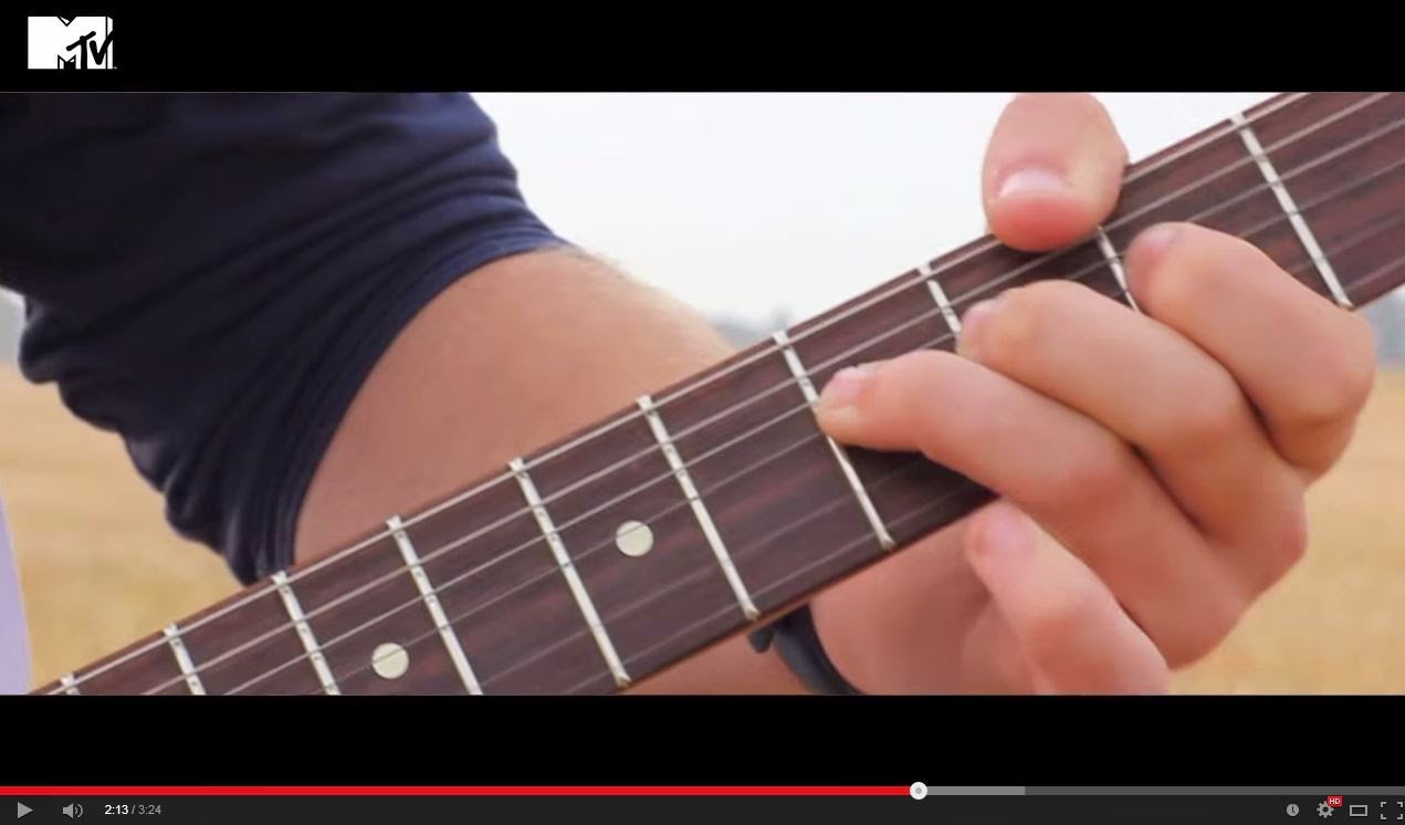
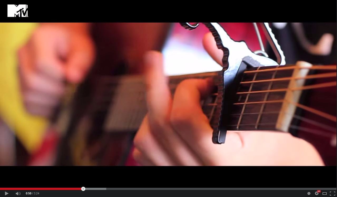
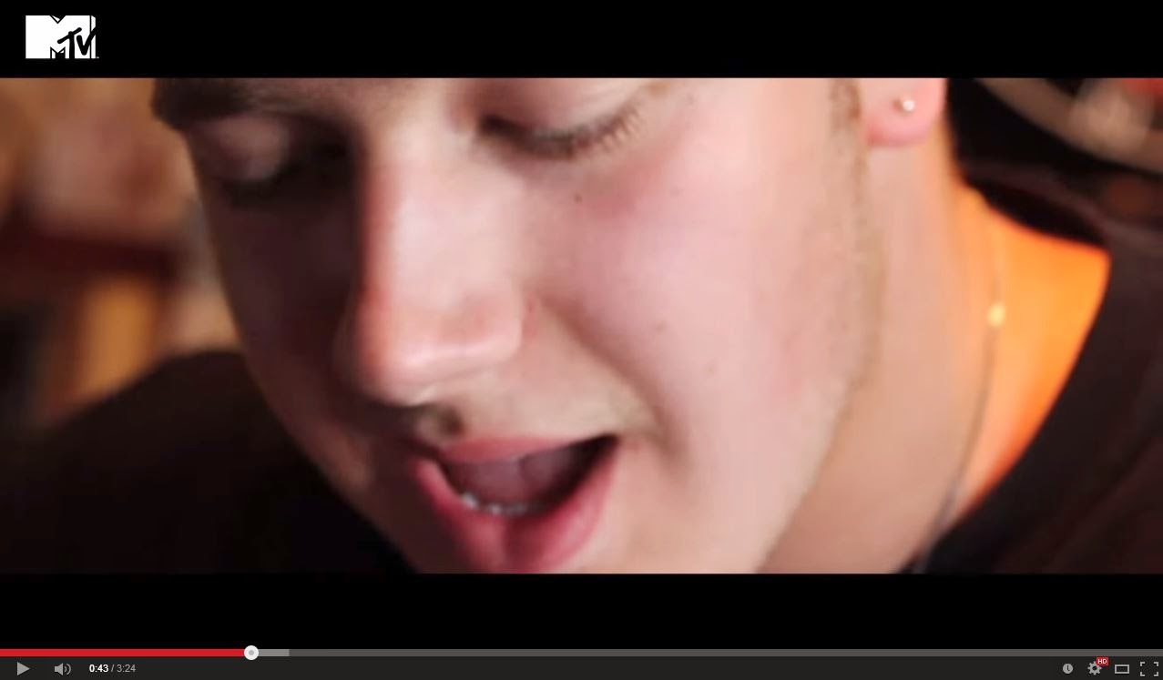
 I think that my music video is mainly performance and with a little bit of narrative. This is because we see a lot of Gianluca playing either his acoustic or electric guitar and he sings. Therefore he is performing in the music video. Also, Gianluca and a female character is seen in a field, what is assumed to be a date, where they are walking down in a field and playing around and 'being romantic'. Therefore we have both a performance by Gianluca and a narrative as we see them both on a date. We say it is mainly performance because in comparison with the narrative, there is more performance.

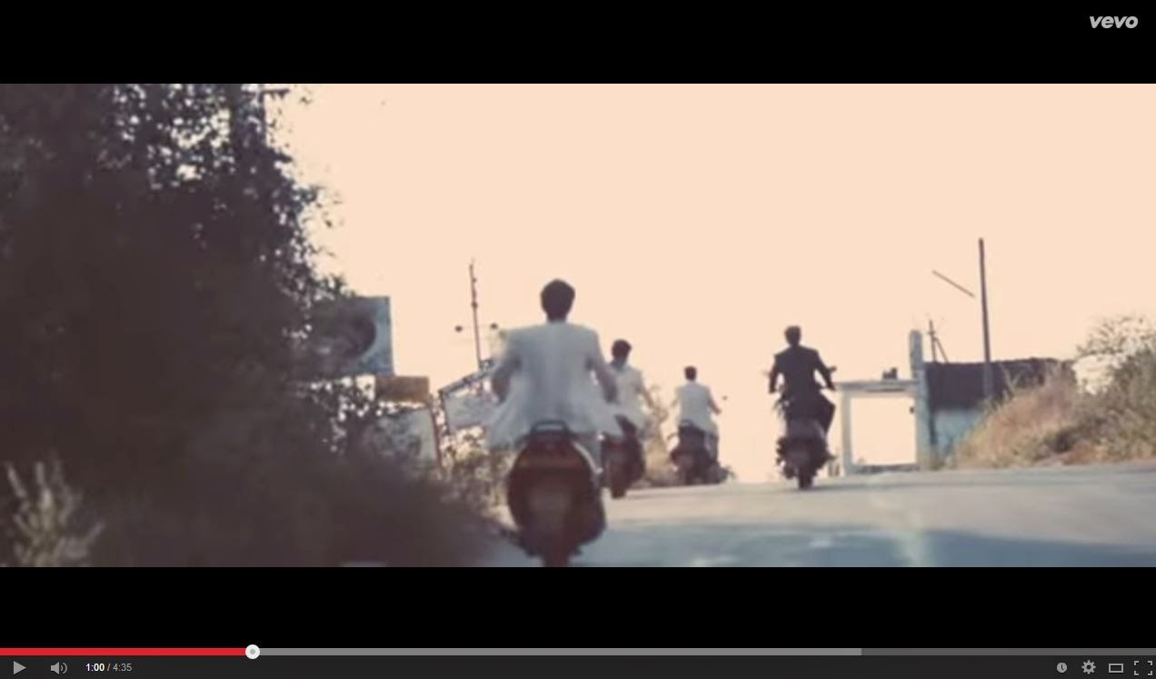
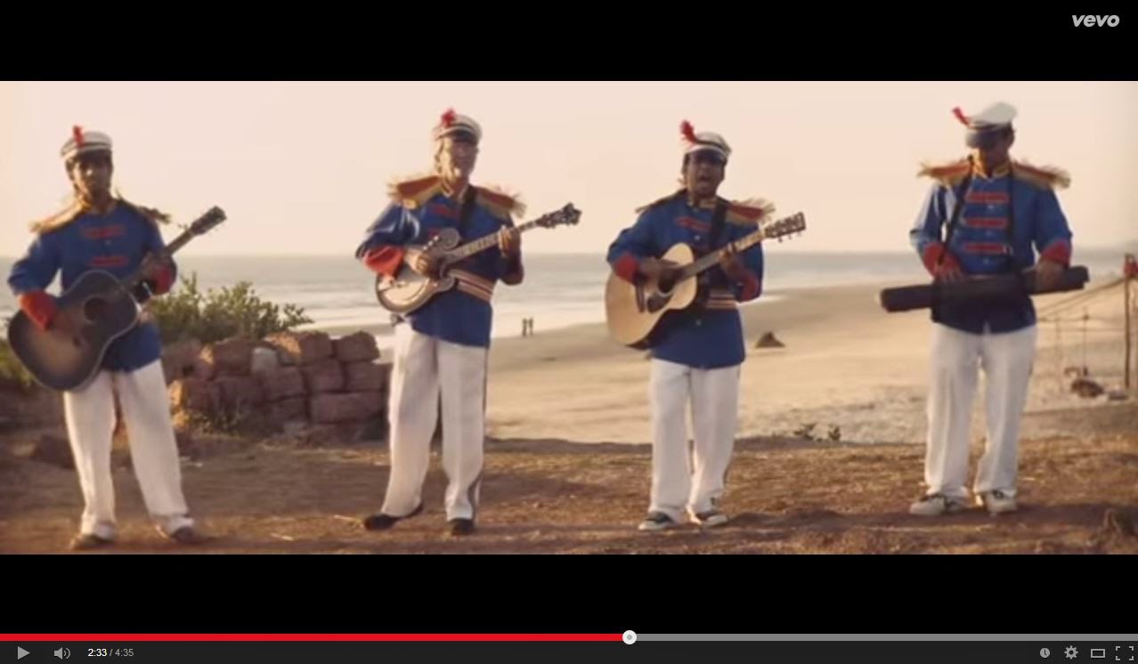
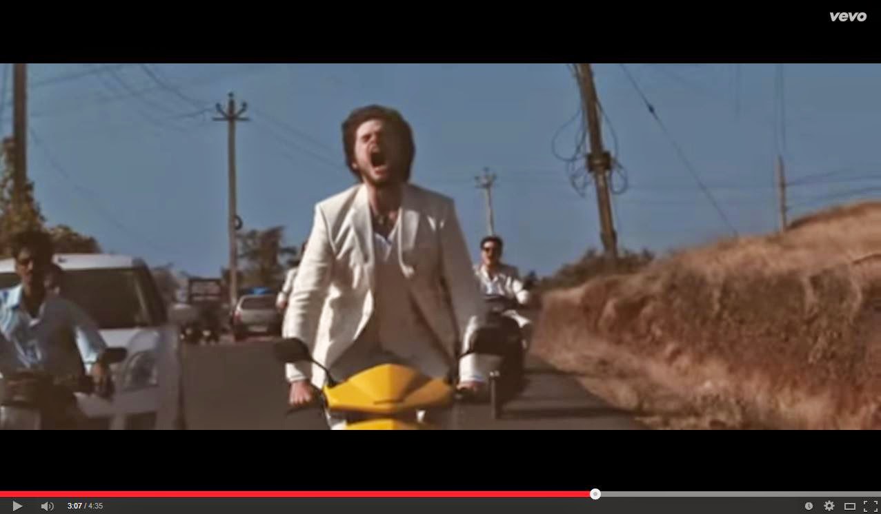
You could compare this to Mumfords and Sons 'The Cave' as they have mostly performance because they are singing and other people are playing instruments but in addition, the band are driving on their mopeds going somewhere.
Another example of the this is Josh Record 'For Your Love', also has mainly performance and a little of narrative. We can see him sing near the window, in the car in the light and dark. In addition, we see a small amount of narrative where we see the girl he is stalking in the music video. We used forms to help us shape our music video and this allowed us to follow the forms to help our artist being understood by consumers and therefore to be identified in the future.


 I think that my music video is mainly performance and with a little bit of narrative. This is because we see a lot of Gianluca playing either his acoustic or electric guitar and he sings. Therefore he is performing in the music video. Also, Gianluca and a female character is seen in a field, what is assumed to be a date, where they are walking down in a field and playing around and 'being romantic'. Therefore we have both a performance by Gianluca and a narrative as we see them both on a date. We say it is mainly performance because in comparison with the narrative, there is more performance.


You could compare this to Mumfords and Sons 'The Cave' as they have mostly performance because they are singing and other people are playing instruments but in addition, the band are driving on their mopeds going somewhere.
Another example of the this is Josh Record 'For Your Love', also has mainly performance and a little of narrative. We can see him sing near the window, in the car in the light and dark. In addition, we see a small amount of narrative where we see the girl he is stalking in the music video. We used forms to help us shape our music video and this allowed us to follow the forms to help our artist being understood by consumers and therefore to be identified in the future.

 We didn't challenge forms as it is very difficult for unexisting artist to be known for a music video that doesn't follow typical forms. Its ok for other more famous and existing artist such as Rudimental to do so because they are already exsiting and many people already know them. Therefore when producing a 'Waiting All Night' music video, many people can still identify this with the band without getting confused like they probably would do with Gianluca Volpe.
You could say it is a concept because it is something different to the actual music/song but actually it is not as this music video is not a typical way of following forms as they have applied a documentary to a piece of music and therefore you do not see the point of the 2 link together. This is a very rare and unique music video and audiences could be easily confused but the fact that most people see 'RUDIMENTAL' music video, they associate the form to their image still.
Conventions and Music Videos
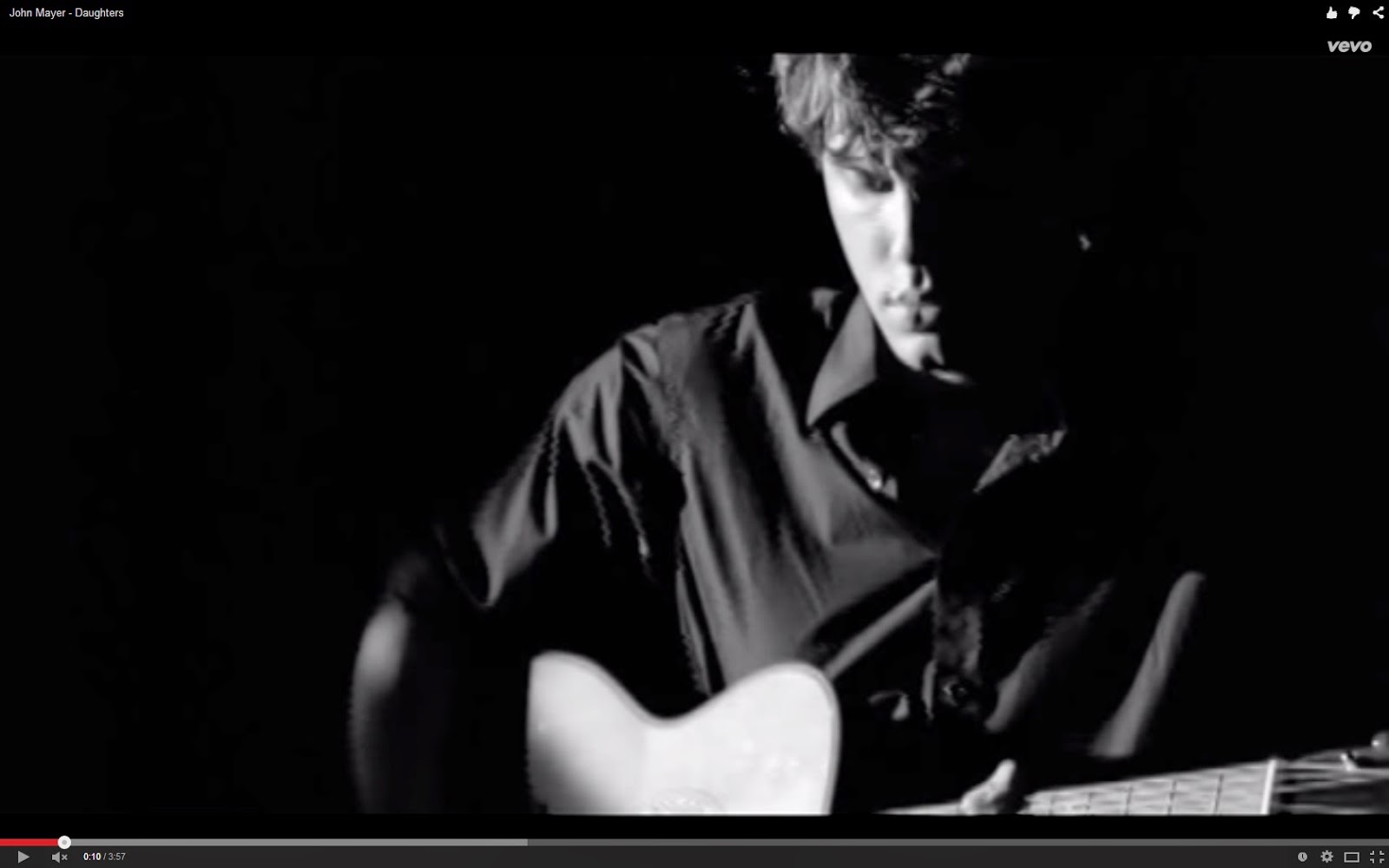


We built our particular music videos from specific genre such as indie or singer songwriter as our artist fit into those characteristics and therefore when producing the music video we grasped key concepts from other music videos similar to our genre to identify the re-occurring ideas. In music videos extreme close ups are the most common shots used as they introduce us to characters or the artist in the video. It may be due to highlight that they are singing or may to be show which emotion they are trying to convey to the audience.
For example, in John Mayer's video, 'Daughters', we see his body and guitar. We also see many close-ups of John Mayer's face throughout the whole music video which we thought would be a good idea to replicate as many videos have close-up which allows the audience feel closer to the artist than wide shots etc... Also, John Mayer is trying to portray something on the music video and so is the Gianluca Volpe therefore putting in close-ups it would help convey the same idea.
Another convention of our genre is Ed Sheeran. Especially as Gianluca is the same genre which is Singer Songwriter and Indie, it is really useful that we used Ed Sheeran for our music video research and applied some of his conventions onto ours. This includes various different shots from Ed Sheeran's 'One' music video, where we see Ed Sheeran play the guitar in basically black and white. Mise en scene plays a big role in a lot of music videos and especially the indie rock genre. This Is because indie artists often have a retro look and this can be created through the sets they use, props and also their own appearance themselves. Ed Sheeran here uses a stadium as a set to show how famous he is perceived to be but he uses no props to show exactly what the titles represents and that is - there is ONE person singing and playing the instrument.

 Related artists to our genre such as Ed Sheeran has a unique look, it may not be as big and elaborate as Lady Gaga but it is related to our genre. It is very unique as he is (kind of ) known for his ginger hair and the fact that he sells albums and stadiums through his voice and guitar. I believe Gianluca Volpe has a unique look : his curly hair, the guitar and now associated music video of a field. Now, he is sort of known for them as there are repeated conventions of these things on his music videos.
 Tilts or pans are used to make the setting clear and can move from left to right so we see the full set and get the most out of the choice of location. This can often help to tell the story as it may be a key feature to the video. I believe that near to the end where we pan a 360 degree on him singing and playing the electric guitar in the field made a big impact as the audience could identify that he is now not with her any more because he has returned to the place where they once hung out, without her and the corn has been cut emphasising that they are not in a relationship.
Editing is now relied on a lot to make a music video successful especially in the indie genre to give it that old fashioned effect. Almost all videos now will have some sort of effect on them to make it either run more smoothly or to even add special effects to make it more interesting. Fast and slow cuts between shots often reflect the pace of the music and link with it well. This helps to put across the mood in the video and also how they want the audience to feel. This interlinks with the editing used in the actual video, for example if a green screen is used like in Coldplay’s- Princess of China to create a set behind and make the story look believable.
We used slow cuts at the start as the music is slower at the start of the song and it represents the start of the relationship. That is what the audience is suppose to feel when watching the start of the music video but towards the end I believe that the music video is suppose to make the audience feel relief or unhappy because they are broken up. We used fast shots between the field with him singing and the field with them both 'on a date'. It represented the quick end that we assume happened in the song and the relationship.
 Effects are often added over the top of videos to make them look old and worn like they are being played from old tapes. This links into the indie rock genre and is very common in videos today. A black and white effect is normally used to convey this but sometimes a sepia tone works too, to make it seem more rustic and raw.
The effects that I have used is a dream look because in the music video he is thinking about the memories. This helped understand and link the two scenes (the bounty and them in the field).
I believe that out of this all we used and developed conventions rather than challenged them as they helped us and allowed the audience to easily identify the genre through the conventions. This allowed the audience to feel the type of thing you would normally feel in a real media product from an Indie and Singer Songwriter genre. We developed the conventions by picking out different things out from each one and applying it to our own music video and in our own way. Also, we chose not to challenge conventions because Gianluca was an unexisting artist and therefore it is harder for an audience to identify the conventions to the music videos and so it means that it is harder for the artist to be identified.
Overall Music Videos
Introduction of Ancillary
But there are many different definitions that are related to media such as
1. Ancillary is an additional feature that assists the main media product.
2. Something that is subordinate or accessory to something else.
3. Something that serves a secondary purpose to the main media product.
The Ancillary products that we made for our artist are these below:
Poster we made
The forms of ancillary is how a product is formed/made/constructed. When looking at artists similar to Gianluca such as Ben Howard there are similar forms.
You can tell that the digi-pack was constructed digitally as the text hasn't been written on and used a font to type it on. In addition, the cd sold over 600,000 copies (when it was certified Platinum), therefore he could have not of written 'Ben Howard' and 'Every Kingdom' on each copy. The CD is a square dimension of 4.724 inches.
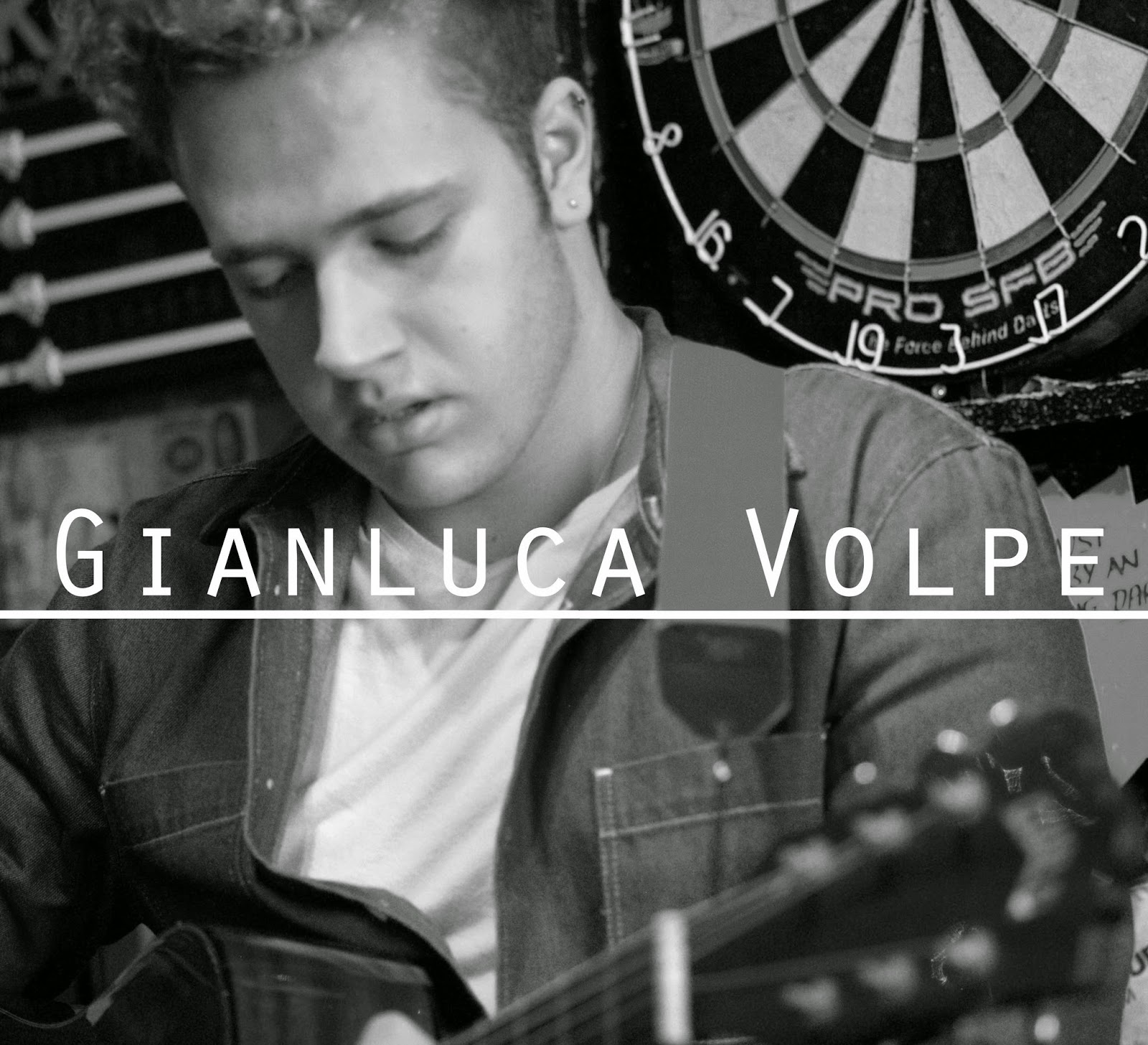 This is much like Gianluca's cd form as it was digitally constructed as although he hasn't sold any hard copies of his cd, the type of writing is very specific, you are not able to hand write the text in anyone's perspective and it cannot be written on a typewriter as it is not than specific to the font. Despite the fact that Ben Howard has colour in the front cover, Gianluca has black and white and it is hard and take a lot of time to hand dye a photo especially if he wishes to take this into copy it for a future album/EP. It is the same size dimensions. By doing it in this dimensions then, if he does wish to use it, he can put it as a front cover of his cd and therefore make copies easier rather than adjust it in the future.
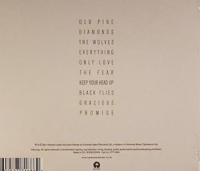
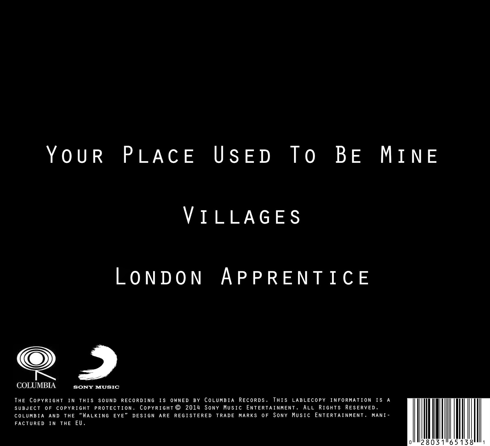
Ben Howard at the back of his album has the same forms but more writing because there are the songs that he has labelled as well as legalities from the company (logo and tradmarks etc...).
Gianluca has the exact same forms and ideas.
The forms of posters are different. As each one is very unique in the way they lay it out.
Ben Howard and Gianluca Volpe's poster is 3.47 x 4.87 inches. It is also digitally formed.
Conventions are entirely unique between each digipak and poster because each artist has something different about themselves and therefore it does not conform to their titled genre or music video. Although, some artists ancillarys do conform to what you would expect i.e. Rapper Music conform to the same or similar typography such as 'Rapscallion'.
In relation to the genre that I have chosen, Ed Sheeran, Ben Howard, Shawn Mendes, John Mayer and George Ezra. These were the most influential to us as they had the same genre and same gender so it is easy to be influential over the similar artist.

Ed Sheeran's album + design is simple yet effective.
Ed Sheeran's colour theme is (mostly) orange, white and black presents us with a bold statement of colour. The orange is the main colour represents his recognisable ginger hair and that has become unique and notorious when referring to his image. I believe that has become its USP (unique selling point) as when you think of Ed Sheeran - his ginger hair is what you think about. Also, it is eye-catching and different which makes it interesting as it is an iconic symbol and statement. Orange represents enthusiasm, fascination, happiness, creativity, determination, attraction and success which could represent him as a person.
Ben Howard's album was a very inspirational album too, especially the back.
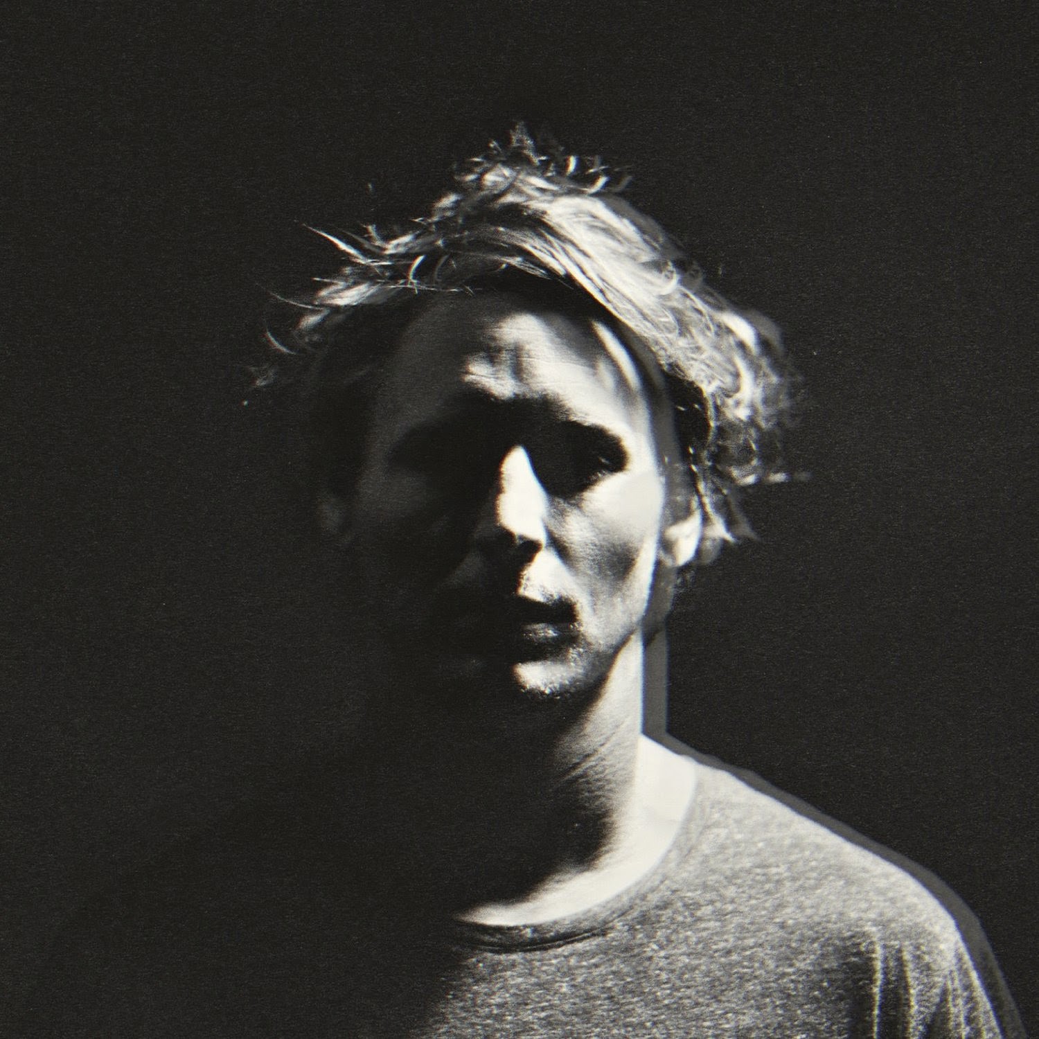
The front cover is Ben Howard himself in black and white without any labels or names etc... As you can see for the genre it is starting to become a very re-occuring thing to place the artists face on the front cover and this is for them to be recognised. But what is very unusual is that Ben Howard was not very well know when this cd did come out and it is very rare for a recording studio and label to not put their artists name on their album as it is hard for the audience to identify the artist name with their face.
As already established, the colour of the cd is black and it is the colour of the hidden, the secretive and the unknown, creating an air of mystery. It keeps things bottled up inside, hidden from the world which might be what Ben Howard is trying to do. As you can see half of his face is covered in the shadow and so we are hidden from the other half of his face.
 But there is also white and the colours meaning in colour psychology is the colour of new beginnings, wiping the slate clean. Therefore you can contrast the album covers meaning by saying that Ben Howard is coming into the light as he is showing his new music to the world.
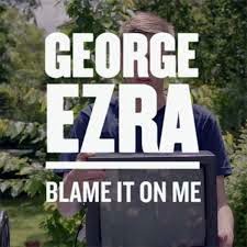
George Ezra had a very fascinating convention on his album because he underlined his name on the album. He also put his name as a smaller font than his surname; Ezra the surname means help or helpful. Maybe putting an emphasis on his name helps make people correlate his feelings and it can represent a bold characteristic and how he is trying to put his name out there.
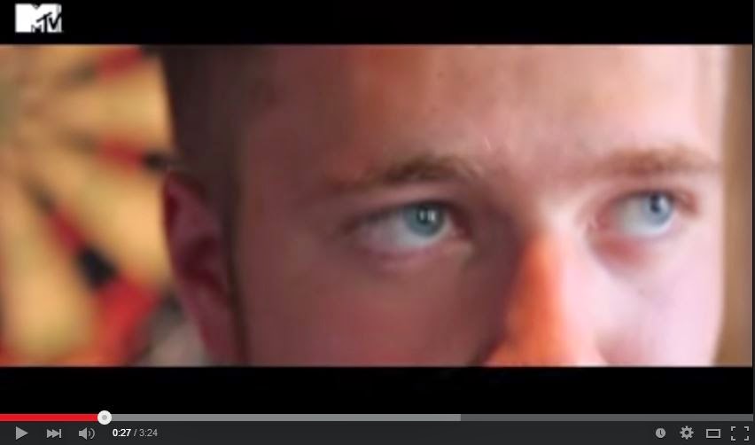
 In the ancillary that we created for Gianluca Volpe, there is no specific colour as we didn't think Gianluca has a distinct colour but rather a distinct feature such as his curly hair and the location we filmed at which was the 'Bounty' pub. I think this has been most substantial convention of Gianluca's digipack and posters because it is now associated to him from his music video. Allowing him to be associated with a convention helps him increase his identity as an artist and so he is more recognised by fans or audiences. His face is a very big icon as well because he is the one singing and playing guitars therefore his face is his image. The Cd is in black and white as we thought the colours that you can see from the actual music video made it too unfocused on the artist. So instead having it black and white made it feel professional and simple. Having the title/his name in the middle and underlined gives the artist a simple but effective classy bold characteristic that is needed for a start-up artist and especially as the line goes round his album, it kind of represents a start of a timeline of events.
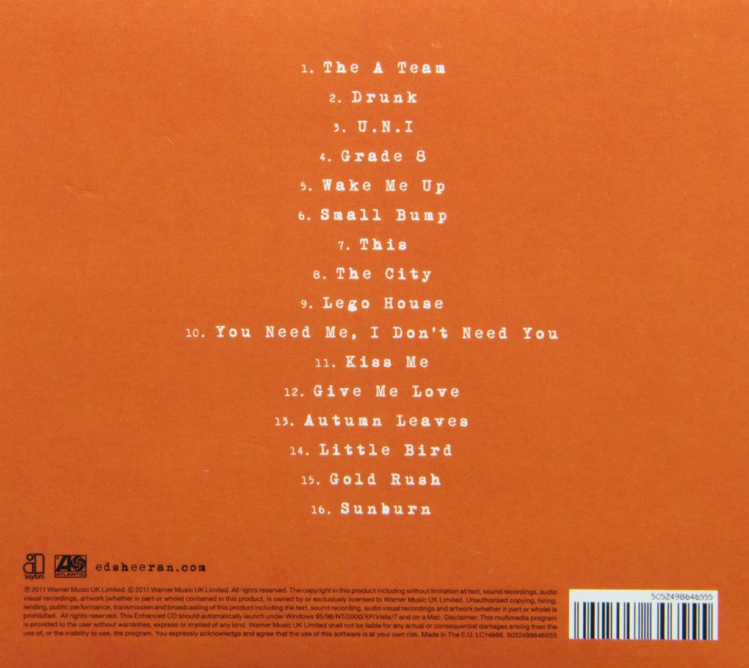 The Use of the barcode on the back of Ed Sheerans album is seemed to show that it is a product for sale like most cds. This is followed by the writing underneath that is a statement from the record company to own all products and to stop copyright.
 The back cover on Ben Howard's album is especially the most inspirational as it is also very simple and great as it does not attract too much attention and conforms to the albums theme. The only strange thing about the back and the whole album, is that it doesn't involve much writing as you would expect a logo of the recording label or any patient or trademark legislations but nothing is included in the label. As a member of the audience, I expected that Ben Howard recorded and created all of the album but after investigating I read that there were 3 labels and so it very much confused me. Although, I have not seen the inside of the album and therefore could be mistaken with this.

I believe that using a barcode helps the audience understand that his album is up for purchase. It easily allows audience to understand it is on purchase without getting confused if it is just a promotional image which is important for a start-up artist such as Gianluca Volpe. As you can see Ben Howard's back cover was very influential because we decided we wanted a simple back cover as we didn't want to attract any attention to the back but rather the front. We took the simplistic convention and we applied it onto our digipak by using our own typography and put the 3 original songs that he has created. In addition, we put a logo and label of a recording label who sign artist in a similar genre to Gianluca so he is associated with not only the genre but the label and other artist.
 Typography is in the text of ‘COURIER’. This is a theme that runs through adverts and cd cover of Ed Sheeran promoting him as an artist. The size of the font is small so it doesn't become the centre focus of the album.
We used the text of (text name insert). This underline and text font is continued throughout the whole album bringing consistency like many other products from the genre use. So it means that we used the genres conventions.
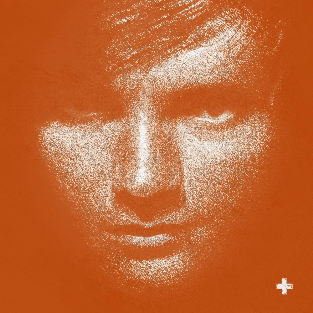 Ed Sheeran is seen in an Indie and Singer Songwriter genre and therefore his facial expression on the album could represent the style of song as he looks very neutral and so his songs could be a neutral vibe - so both happy and sad song. He is also looking straight towards the camera which creates a sense of direct address towards the audience making it feel more personal when someone does purchase his cd as it is as if he is looking at us/me.
 You could say the same for Ben Howard as the style is very neutral and looking straight towards the camera whilst the camera view is straight on as well.
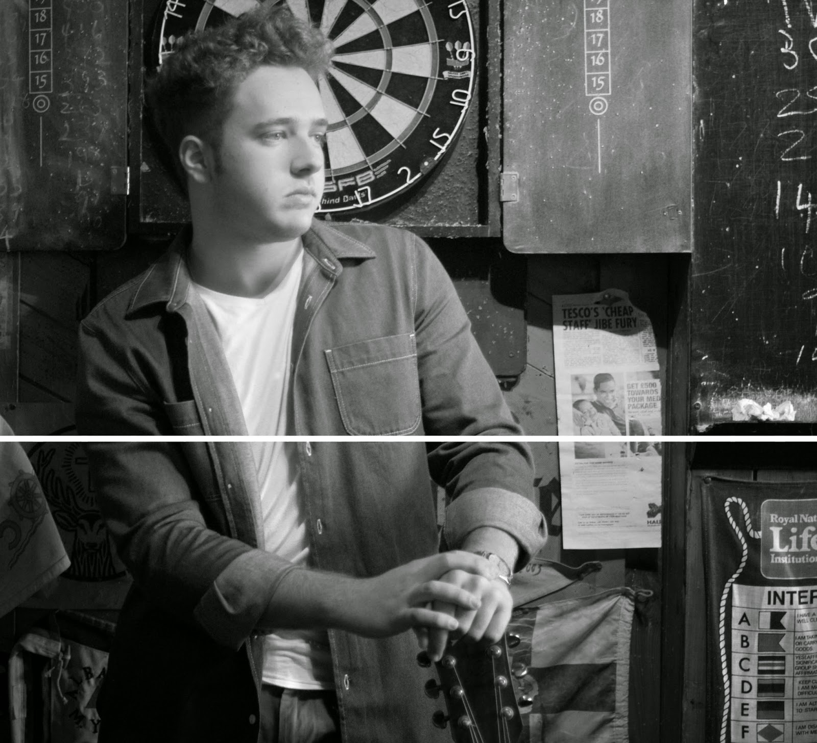 Gianluca doesn't do this and I believe we challenged the conventions of real media products in his genre so far. This is unusual as so far we have met convention in every possible way apart from looking directly at the camera. I think looking away relates to his music video where he is more interested in the memories that he formed with the girl that he liked. Also, looking away or facing down to the guitar (which is on the front cover) sets a bit of mystery and enigma as we want to find out more about this character and this can entice his audience or fans to buy his upcoming Ep or album. But we still feel close to the artist as although he is not looking at us, the front cover is a close up and therefore we feel close with him.
For George Ezra's Tour Poster was basically the same ideas but a bit bigger. It clearly states all off his tour dates whilst having the same background photo of his album making it easier for people to identify the poster. But what was different about this was that the designer didn't just put the cd dimensions on the poster like they did for Ben Howard's poster but they expanded it or took extra photos to cover the whole poster and kept his face somewhat in the poster.
I believe that we mostly used the forms and conventions of real media products out there to stay within the conventions of a singer songwriter genre. This overall intention led us to associate Gianluca with his rightful genre which helped him as an artist and us to understanding the business. Although, I do think that we challenged a few conventions because every artist has something unique about their album, music and poster that sets them aside from the rest and that is the few conventions that we challenged to enable him to not conform to all other singer songwriters.
1. Ancillary is an additional feature that assists the main media product.
2. Something that is subordinate or accessory to something else.
3. Something that serves a secondary purpose to the main media product.
The Ancillary products that we made for our artist are these below:
Front Cover Inside Right Cover
Inside Left Cover Back Cover
Poster we made
Forms of Ancillary's
You can tell that the digi-pack was constructed digitally as the text hasn't been written on and used a font to type it on. In addition, the cd sold over 600,000 copies (when it was certified Platinum), therefore he could have not of written 'Ben Howard' and 'Every Kingdom' on each copy. The CD is a square dimension of 4.724 inches.
 This is much like Gianluca's cd form as it was digitally constructed as although he hasn't sold any hard copies of his cd, the type of writing is very specific, you are not able to hand write the text in anyone's perspective and it cannot be written on a typewriter as it is not than specific to the font. Despite the fact that Ben Howard has colour in the front cover, Gianluca has black and white and it is hard and take a lot of time to hand dye a photo especially if he wishes to take this into copy it for a future album/EP. It is the same size dimensions. By doing it in this dimensions then, if he does wish to use it, he can put it as a front cover of his cd and therefore make copies easier rather than adjust it in the future.

Ben Howard at the back of his album has the same forms but more writing because there are the songs that he has labelled as well as legalities from the company (logo and tradmarks etc...).
Gianluca has the exact same forms and ideas.
The forms of posters are different. As each one is very unique in the way they lay it out.
Ben Howard and Gianluca Volpe's poster is 3.47 x 4.87 inches. It is also digitally formed.
Conventions of Ancillary
In relation to the genre that I have chosen, Ed Sheeran, Ben Howard, Shawn Mendes, John Mayer and George Ezra. These were the most influential to us as they had the same genre and same gender so it is easy to be influential over the similar artist.

Ed Sheeran's album + design is simple yet effective.
Ed Sheeran's colour theme is (mostly) orange, white and black presents us with a bold statement of colour. The orange is the main colour represents his recognisable ginger hair and that has become unique and notorious when referring to his image. I believe that has become its USP (unique selling point) as when you think of Ed Sheeran - his ginger hair is what you think about. Also, it is eye-catching and different which makes it interesting as it is an iconic symbol and statement. Orange represents enthusiasm, fascination, happiness, creativity, determination, attraction and success which could represent him as a person.
Ben Howard's album was a very inspirational album too, especially the back.
The front cover is Ben Howard himself in black and white without any labels or names etc... As you can see for the genre it is starting to become a very re-occuring thing to place the artists face on the front cover and this is for them to be recognised. But what is very unusual is that Ben Howard was not very well know when this cd did come out and it is very rare for a recording studio and label to not put their artists name on their album as it is hard for the audience to identify the artist name with their face.
As already established, the colour of the cd is black and it is the colour of the hidden, the secretive and the unknown, creating an air of mystery. It keeps things bottled up inside, hidden from the world which might be what Ben Howard is trying to do. As you can see half of his face is covered in the shadow and so we are hidden from the other half of his face.
 But there is also white and the colours meaning in colour psychology is the colour of new beginnings, wiping the slate clean. Therefore you can contrast the album covers meaning by saying that Ben Howard is coming into the light as he is showing his new music to the world.
George Ezra had a very fascinating convention on his album because he underlined his name on the album. He also put his name as a smaller font than his surname; Ezra the surname means help or helpful. Maybe putting an emphasis on his name helps make people correlate his feelings and it can represent a bold characteristic and how he is trying to put his name out there.


 In the ancillary that we created for Gianluca Volpe, there is no specific colour as we didn't think Gianluca has a distinct colour but rather a distinct feature such as his curly hair and the location we filmed at which was the 'Bounty' pub. I think this has been most substantial convention of Gianluca's digipack and posters because it is now associated to him from his music video. Allowing him to be associated with a convention helps him increase his identity as an artist and so he is more recognised by fans or audiences. His face is a very big icon as well because he is the one singing and playing guitars therefore his face is his image. The Cd is in black and white as we thought the colours that you can see from the actual music video made it too unfocused on the artist. So instead having it black and white made it feel professional and simple. Having the title/his name in the middle and underlined gives the artist a simple but effective classy bold characteristic that is needed for a start-up artist and especially as the line goes round his album, it kind of represents a start of a timeline of events.
 The Use of the barcode on the back of Ed Sheerans album is seemed to show that it is a product for sale like most cds. This is followed by the writing underneath that is a statement from the record company to own all products and to stop copyright.
 The back cover on Ben Howard's album is especially the most inspirational as it is also very simple and great as it does not attract too much attention and conforms to the albums theme. The only strange thing about the back and the whole album, is that it doesn't involve much writing as you would expect a logo of the recording label or any patient or trademark legislations but nothing is included in the label. As a member of the audience, I expected that Ben Howard recorded and created all of the album but after investigating I read that there were 3 labels and so it very much confused me. Although, I have not seen the inside of the album and therefore could be mistaken with this.
I believe that using a barcode helps the audience understand that his album is up for purchase. It easily allows audience to understand it is on purchase without getting confused if it is just a promotional image which is important for a start-up artist such as Gianluca Volpe. As you can see Ben Howard's back cover was very influential because we decided we wanted a simple back cover as we didn't want to attract any attention to the back but rather the front. We took the simplistic convention and we applied it onto our digipak by using our own typography and put the 3 original songs that he has created. In addition, we put a logo and label of a recording label who sign artist in a similar genre to Gianluca so he is associated with not only the genre but the label and other artist.
 Typography is in the text of ‘COURIER’. This is a theme that runs through adverts and cd cover of Ed Sheeran promoting him as an artist. The size of the font is small so it doesn't become the centre focus of the album.
We used the text of (text name insert). This underline and text font is continued throughout the whole album bringing consistency like many other products from the genre use. So it means that we used the genres conventions.
 Ed Sheeran is seen in an Indie and Singer Songwriter genre and therefore his facial expression on the album could represent the style of song as he looks very neutral and so his songs could be a neutral vibe - so both happy and sad song. He is also looking straight towards the camera which creates a sense of direct address towards the audience making it feel more personal when someone does purchase his cd as it is as if he is looking at us/me.
 You could say the same for Ben Howard as the style is very neutral and looking straight towards the camera whilst the camera view is straight on as well.
 Gianluca doesn't do this and I believe we challenged the conventions of real media products in his genre so far. This is unusual as so far we have met convention in every possible way apart from looking directly at the camera. I think looking away relates to his music video where he is more interested in the memories that he formed with the girl that he liked. Also, looking away or facing down to the guitar (which is on the front cover) sets a bit of mystery and enigma as we want to find out more about this character and this can entice his audience or fans to buy his upcoming Ep or album. But we still feel close to the artist as although he is not looking at us, the front cover is a close up and therefore we feel close with him.
With the posters we made for him, we used ideas from other artists but mostly utilised our own artwork and put it in the poster. By creating two, we used both common coventions that are usually seen. One is putting the dimensions of the cd duplicated on the poster or/and the other placing a similar photo and resizing it to the poster's size.
Firstly Ben Howard's poster, this poster was of great help to us because we could see the blending of the photo taken of him with the darkness/black colour to make it look like a poster. That poster used the conventions as the artist is a singer songwriter and he has looked at the camera giving the effect of looking at the audience. Also, it helps the audience to identify his music because it is similar to his album cover so we know it is Ben Howard's tour.
We thought it would be good and used this for our first tour poster because for the fans and audiences of Gianluca Volpe, we can identify that his album cover is on his poster and there is a consistency therefore it truly is his tour.
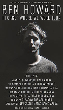
We thought it would be good and used this for our first tour poster because for the fans and audiences of Gianluca Volpe, we can identify that his album cover is on his poster and there is a consistency therefore it truly is his tour.

For George Ezra's Tour Poster was basically the same ideas but a bit bigger. It clearly states all off his tour dates whilst having the same background photo of his album making it easier for people to identify the poster. But what was different about this was that the designer didn't just put the cd dimensions on the poster like they did for Ben Howard's poster but they expanded it or took extra photos to cover the whole poster and kept his face somewhat in the poster.
On one hand I think it is a clever idea but on the other hand , I think that it is difficult to know where or what it is. The descriptions and titles makes it clear but other than that it is kind of confusing because we see other people as well just focuses our attention to them rather than him.
Also, this Taylor Swift poster was vital for us because we definitely used thought that we could use the social media aspect to the poster because it helps not only the audience to get in touch with the artist but helping the artist get better recognition. As digital natives, it is easier and better if the artist is on social media because everyone is on the internet and if you are not, you are/it is somewhat a social outcast. In addition, the tour poster has the logos of the different companies that have helped create the poster and possibly funded the tour. This is a legality for some albums/companies and so to understand and experience some of them, we researched the typical singer songwriter recording studio and placed them on our posters. We also, put the iTunes logo and stated that you can find the album on there. This was all to make Gianluca easier to find as well as promote him.
Overall Ancillary's
I believe that we mostly used the forms and conventions of real media products out there to stay within the conventions of a singer songwriter genre. This overall intention led us to associate Gianluca with his rightful genre which helped him as an artist and us to understanding the business. Although, I do think that we challenged a few conventions because every artist has something unique about their album, music and poster that sets them aside from the rest and that is the few conventions that we challenged to enable him to not conform to all other singer songwriters.


No comments:
Post a Comment